We could talk about colours all day long. It’s only one part of the painting process, but picking the right colour is essential. Using colour when painting shouldn’t be something to be scared of, a lot of the time, people feel so overwhelmed that they don’t know what to pick.
Taking the time to understand colour theory and how colours work together can make much difference when picking a paint colour. It’s a great way to know why you might love a colour sample, but when you take it home, it doesn’t favour the room you planned. Picking a colour palette gives you a fantastic source of inspiration and hints at colours you wouldn’t have considered previously.
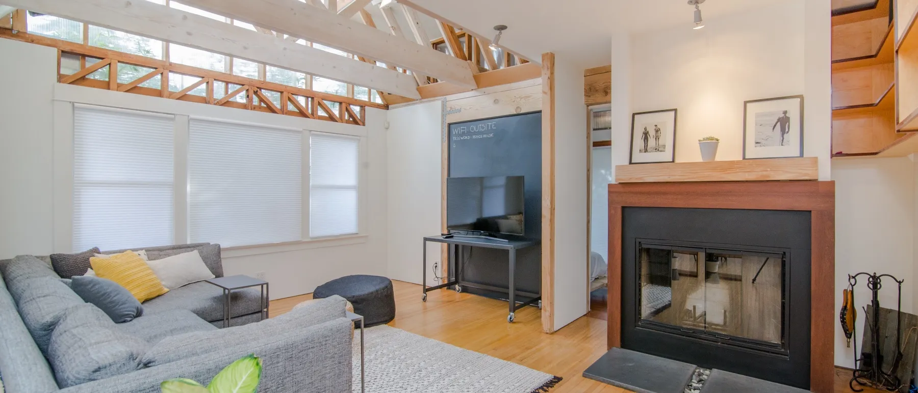
If you’re already way past this and up to picking a paint colour for the interior or exterior of your home, click here to read our blog post to give you some extra tips and tricks.

Primary Colours
Starting at the fundamental level are the primary colours: red, blue and yellow. If you were to mix all of these three, you get either a green to brown sort of tone. However, if you combine two of them, you then get secondary colours.
Secondary Colours
Secondary colours are the three colours that come from mixing a combination of primary colours. These colours are green, orange and purple. An example is if you mix yellow and blue, you’ll get green.
Tertiary Colours
Tertiary colours spice up the colour wheel. They bring vibrancy and life to your paint. Tertiary colours are essentially endless; however, basic tertiary colours are,
- Yellow orange
- Red orange
- Red violet
- Blue green
- Yellow green
Once you understand the basics of the colour wheel and before you get too excited about picking a paint colour for your room, take the time to warm and cool colours. If you were to split the colour wheel in half, depending on how you look at it, your reds, oranges, etc., are warm, and your blues and greens are cool.
Notice we haven’t mentioned either white or black yet? That’s because this is when you’d bring in hue, tint, tone and shade. These are as follows,
Hue: Pure colours
Tints: Hue + white
Tones: Hue + grey
Shades: Hue + black
White and black are built around all of the colours on the colour wheel. They’re introduced later; we recommend picking your boldest colour and then picking your palette after this. You’ll also be able to decide if you want a cool or a warm white up against the bold blue you’ve chosen.
Now for the fun part of picking your colour palette, listed below are the elements that make up a colour palette. It’s almost impossible to go from if you choose a palette and stick to it; they will make sure colours work together harmoniously.
Complementary Colours
Once you understand the basics of your colour wheel, this is when you create a colour palette to suit the room or area you’re painting. Complementary colours are colours that sit opposite each other on the colour wheel. Due to these colours standing out so much, pick on and use it as an accent and then use the other in soft furnishing or elsewhere in the room or area.
Split Complementary
Split complementary is a variation of complementary. This colour palette uses one colour as a ‘base’ colour and then uses two colours across from it on the colour wheel. It’s much less contrasting than complementary colours; however, it still creates a level of interest.
Monochromatic
Monochromatic is still a colour palette; it’s a variant of one colour. These colour schemes give off a relaxing feeling and give a delicate appearance to a room.
Analogous
Analogous is when you pick one main colour and two colours directly next to it. If you want to incorporate more colours, choose two additional colours outside the original two to create a five colour scheme.
Triadic
A triadic colour scheme is for those who go big or go home; it chooses colours placed around the wheel at the same level of intensity.
If this process of finding which colours work well together and what doesn’t and there is just too much, don’t stress. We provide a colour consulting service to ensure you pick the right paint colours for the right job.