The days of clinical, monochrome offices with sterile walls are over — but matching the right colours to the right environment, is more important to success than blindly adding a splash of something with a hasty paintbrush. A well-maintained premises that uses colour to enhance its function hosts a happier, more productive community.
Take an office block, for instance: plenty of green is said to inspire creativity which boosts productivity, while blues have a calming effect. A green palette in work spaces may serve businesses well, and they’d best match their blues to meeting rooms where tempers can get heated.
Burning to know more? Take a dive into 3 colours you can bring onto your premises to boost concentration and productivity:
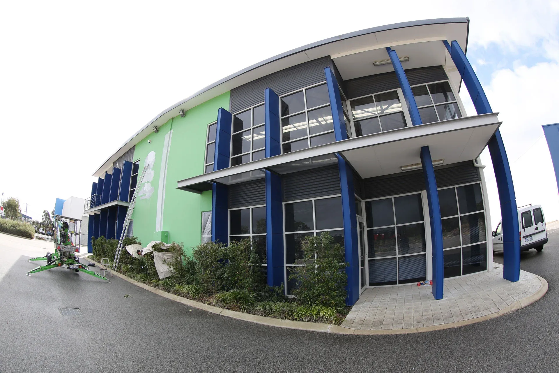
Blue
Your response to colour is context dependent. Our cultural conditioning and physical environment influences how colours affect us, but some colours can tap into our psychology in a way that bypasses rational thought. Our bodies are wired to respond favourably to blue. It’s the colour of water and sky — the things life on this planet depends on. That’s why blues are great anywhere you want a calm, reassured atmosphere. As a cool colour, it’s especially conducive to intellectual work — so meeting rooms are a perfect place to experiment with blue shades. Office personnel will thank you the minute they realise all their calm, clear thinking is thanks to last week’s paint job!
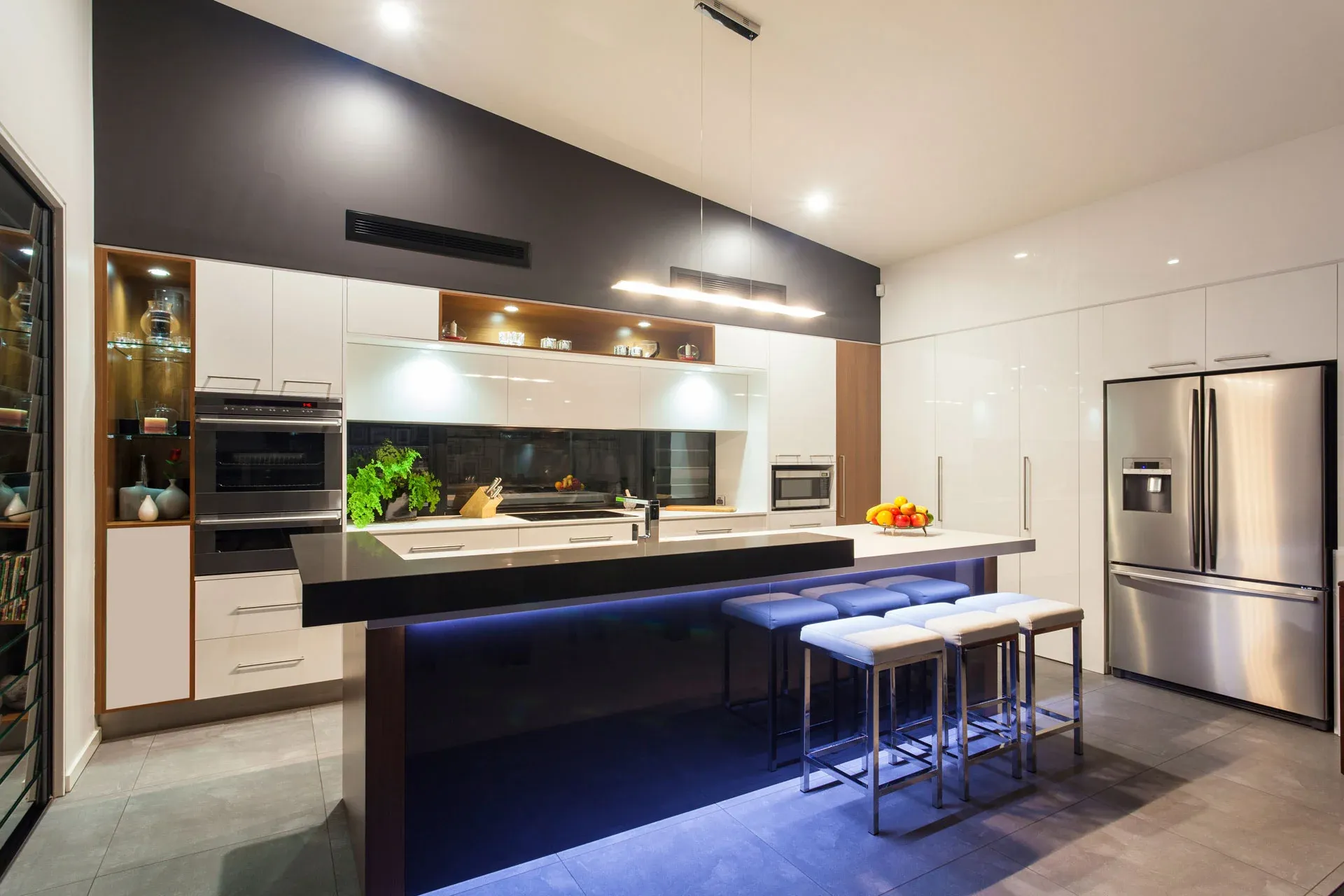
Orange
Keep the colour palette too cool and you’ll inspire an aloofness in people that’s too unfriendly by miles! A splash of warmth helps liven things up a bit, and drives the energy that can then be channeled into intellectual pursuits in “blue spaces”. Orange is great for social spaces, such as the kitchen/break room, because it can revive energy, refocus flagging concentration and stimulate interpersonal connection. But choose your tint or shade wisely — too much orange can easily overwhelm someone just looking for a quick coffee. Strong colours, like orange, are often best confined to a feature wall that draws focus without taking over the space.
Green
Being a mix of blue and yellow — or, “water” and “sunshine” — lends green an association with life and wellness that’s hard to beat in almost any culture. Shades of green are a perfect way to inspire the creativity and focus that comes from a reassuring environment. That’s because we subconsciously read them as fertile, above freezing and well-supplied with water. It’s a challenging colour to introduce to a building though, because it appears in nature in a range of hues. But you’re not limited to paint when decorating an office or commercial premises. Bringing in easy-to-care-for plants to add a green accents throughout would compliment the blue and orange tones well, and improve the air quality too!
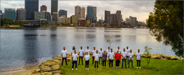
While plants are a lovely way to get a colour accent in, nothing beats paint for big, bold introductions of colour. Reputable commercial painters will help you transform the whole premises in a short time, with minimal disruption to your tenants. Barker-Whittle have brought the benefits of well-chosen colour to Perth with commercial painting services for more than three decades — contact us to request a no-obligation quote and reap the rewards yourself.