Choosing the most appealing colour scheme for any room in your home is very difficult, and not just because of the near-limitless selection you can choose from. It’s a little known fact that the right colour scheme can actually influence whether the room feels cool or warm, and figuring out which ones actually exude these temperatures is the challenge.
Luckily, you’ll only have to remember three major colour schemes when it comes to choosing the temperate colour for your home: warm, cool, and neutral colour schemes.
Warm & Cool: Stimulating & Relaxing
Warm colours are generally stimulating, invoking feelings and even soothing our emotions. The main colours that generate warmth are red, orange, white, and yellow. These colours are best suited for rooms where a lot of socialising goes on, such as in the dining and living rooms. Red, in particular, is a tasty colour that has the uncanny ability to make us feel hungry, which is why most fast food colours are dominated by these shades.
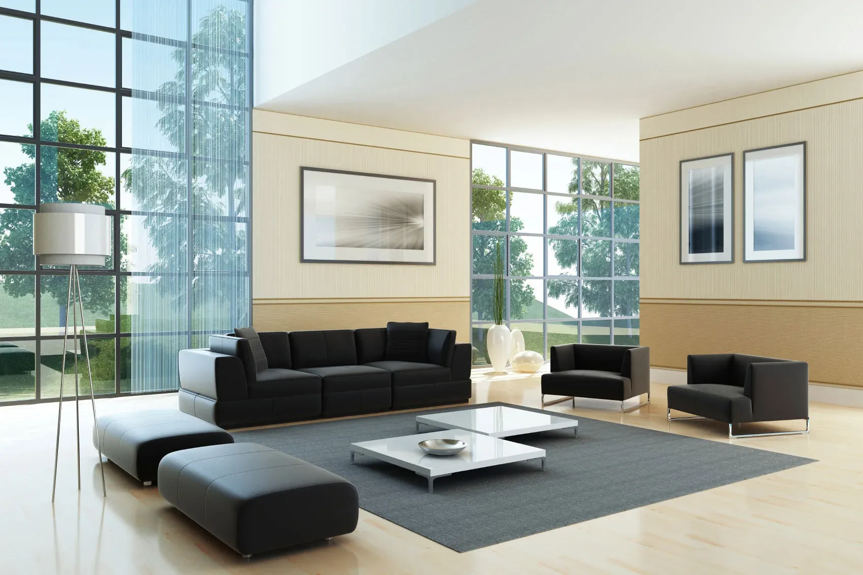
Cold colours are more soothing and are better for rooms where you’d want to relax and cool off. Blue, brown, grey, and darker shades of green all possess cool qualities and in contrast to warm colours, these calm down emotions and help us focus better. These colour schemes are ideal for bedrooms and nurseries, as well as study areas where the cold colour can help your mind relax and focus.
Contrast or Consistency?
Generally, you’ll want to keep your room in one colour scheme in order for their properties to work. Dining rooms, for example, would benefit from a predominantly red colour scheme with touches of orange and yellow, while a bedroom dominated by blue should have bits darker tone colours to further exude calmness.
It’s okay to be creative, though, and a mix of cool and warm colours can help really bring your home’s interior living spaces to life. The important rule to remember is that the warm and cool colours shouldn’t contrast that much, and should ideally be near each other within the colour wheel.
The colour red, for example, sits near the blue colours in the colour wheel. Since red is a lighter colour, the blue shades should be light as well if you want them to work together.
On the other hand, colours that are in direct opposition to one another can actually work as well, provided that the contrast is subtle. Green, for example, sits right across the colour red. Although they naturally clash with one another, you can make a warm room dominated by the colour red a lot warmer if you add a touch of green in certain areas.
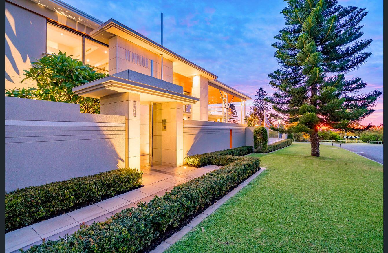
At Barker-Whittle, we know that choosing the right colour scheme may not exactly be everyone’s speciality. If you need help deciding the best colour schemes that generate warmth or coolness for your home’s interior living spaces, then give us a call and let us help you out.