There is plenty of choice; vibrant yellow, zesty oranges and cool aqua.
This palette can easily be used all together or individually. Definitely don’t be too serious with these. The look is casual and festive.
When thinking about painting walls in these saturated colours look for a small but well defined area. Ideally one that is a strong focal point. These bold colours are more effective in small splashes. Also you can then easily change next season.
The yellow would be the most challenging to use on a whole wall. You would need some other strong elements to offset it such as a charcoal floor covering or sofa.
An easy colour to use on larger areas are the aqua blues. These green based blues work with most colour schemes. They can refresh an earthy warm interior and act as a highlighting contrast to all timbers. Aqua blue will harmonise well with grey and predominately white schemes.
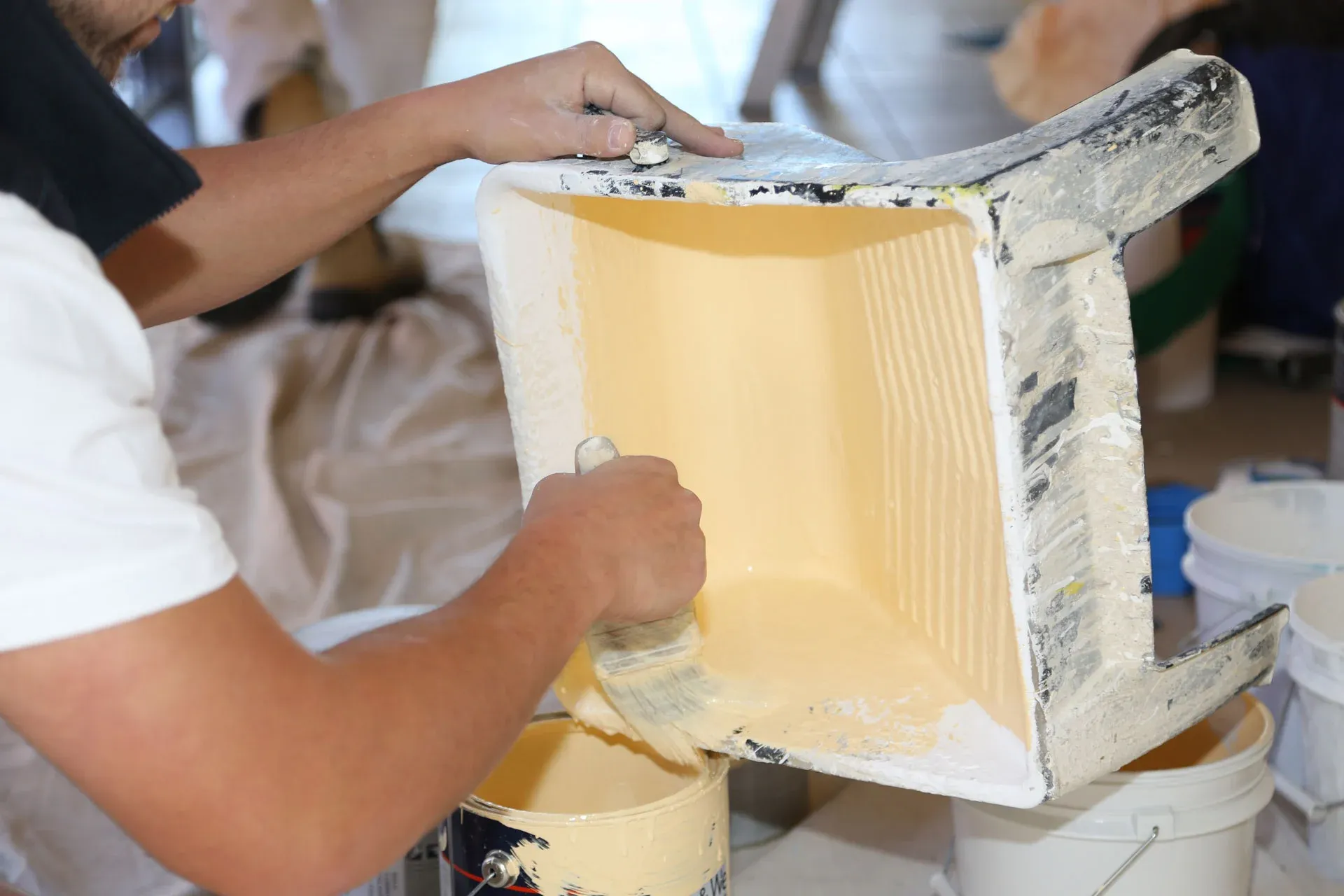
Of course painted colour is not just for the walls. Painting your furniture is a great way to introduce bold colour. True story, I plan to paint my dining chairs (any day now!) Dulux Décor Splash. Will post the ‘before and after’ on the Barker-Whittle blog once finished.
Paint really is the most versatile accessory. Consider other items that may be looking out of date or worn, such as vases and picture frames and get painting!
Because this summer’s colours are so zingy it is easy to make a big change with just a few cleverly placed items.
By Colour Consultant Heidi La Cava