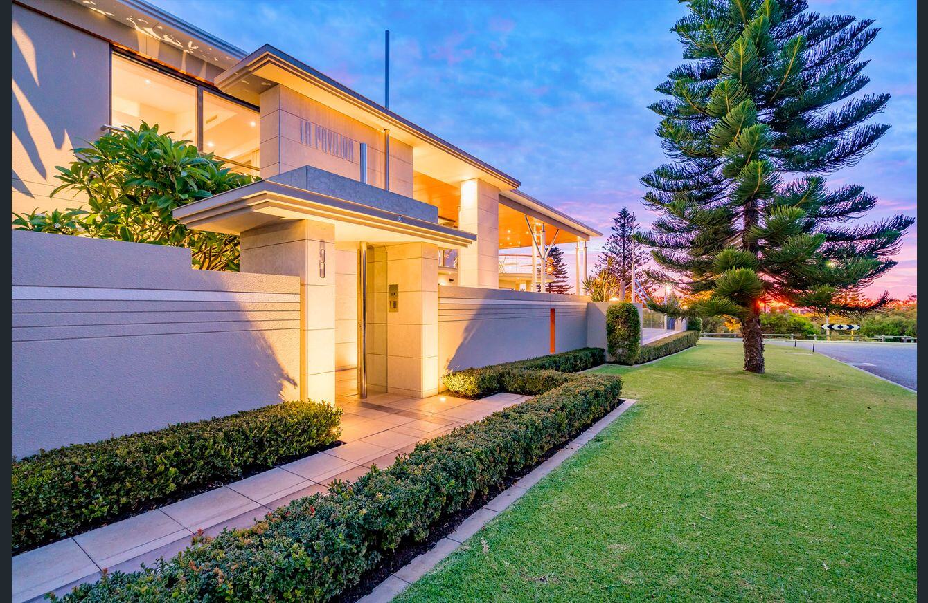
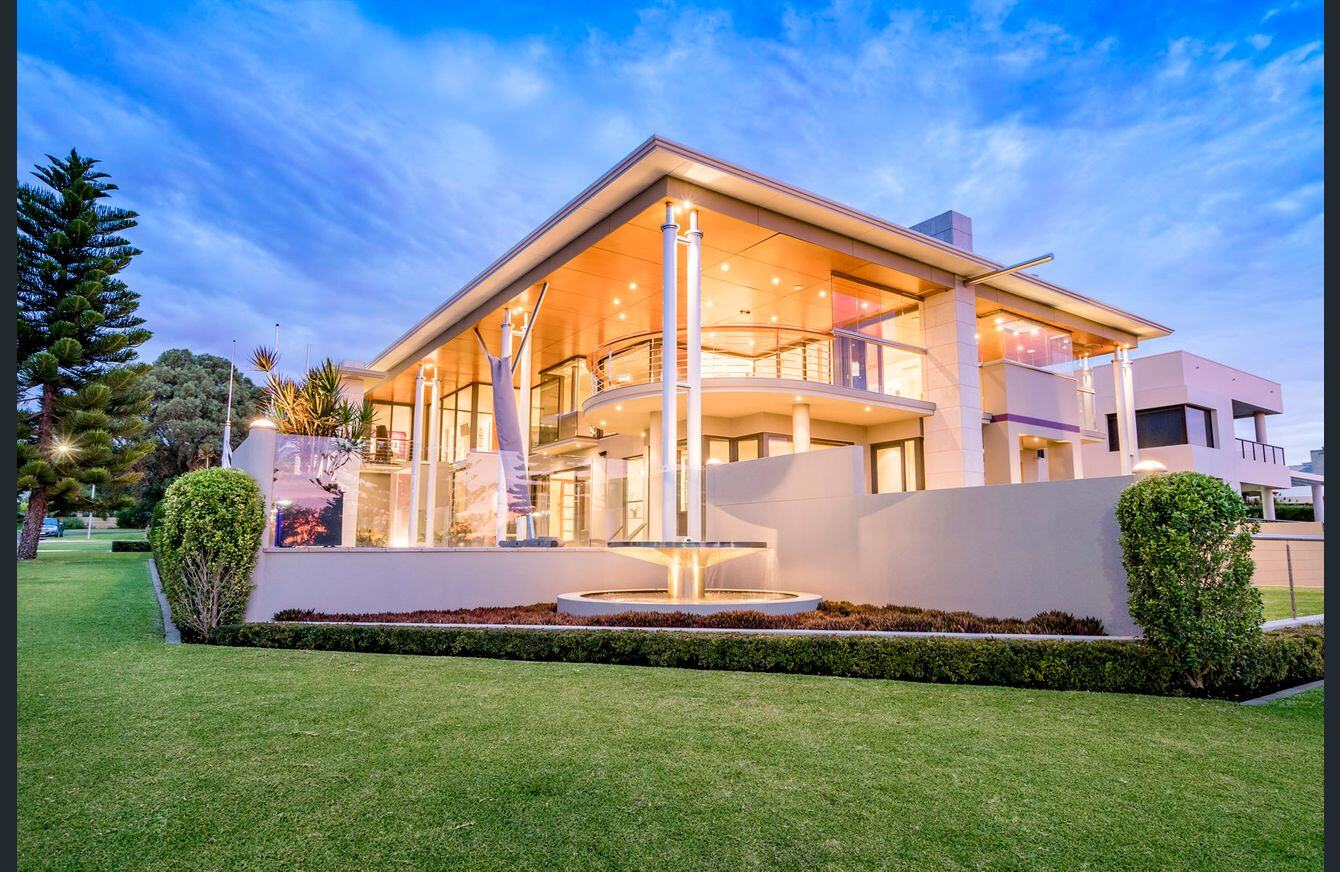
If you’re thinking repainting your home or office, you’ve probably stumbled across blogs that share tropes like “red conveys power” and “blue helps you think”. By the time the commercial painters arrive, you’ll already need a clear idea of what paint you’ll be choosing. We share 5 principles that help you set the mood of your rooms with colour.
1: Combine Colours for Best Effect
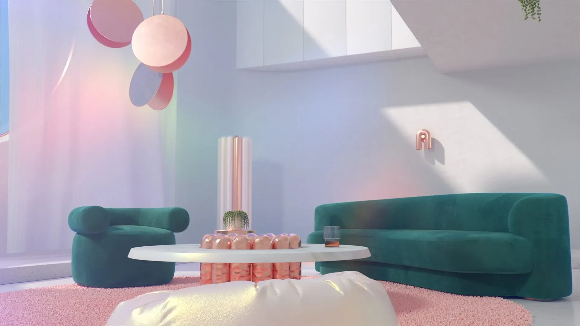
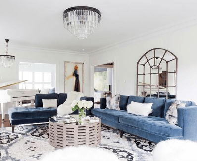
Using more than one colour in the same space can show each of them off to best effect. Using accents of white on your finishes, for instance, does an excellent job of highlighting blue walls.
Also experiment with different shades of the same colour to get a similar effect. This creates a visual variation that keeps the eye engaged on the main feature for longer than if it was the only colour in the room. Another great way to introduce accent colours into a room is with art or objets d’art, such as a large painting or beautiful vase.
2: Set Limits
Too many colours in one space create a cluttered look that leaves you feeling disordered and visually fatigued. Limit yourself to three colours per space and use the golden ratio as a rule of thumb to ensure visual balance — the 10-30-60 rule. Let your dominant colour cover 60% of the space, your secondary colour 60% and limit your bolder accent colour to 10% of the room. Use everything at your disposal to bring these colours in — walls are just one of them, but you could also use your blinds/curtains or decor items and furniture to make up your ratios.
3: Play Into The Room’s Purpose
Choose your colours based on what you’d like to do in each room. This is where colour theory really comes in handy — kitchens are great places for energetic yellows, and your bedroom would do better with a luxurious range of purples. Decide on an active, passive or neutral colour palette based on a combination of the rooms’ function and your taste.
4: Know When To Use Light or Dark
Colour works in combination with light. Learn how each room is affected by artificial and natural light over the course of a day (or, ideally, a season) and choose a wall colour that works with it. In a room with structural features that cast deep shadows, you’d be better off with darker tones. Shadows can make light walls look muddy, while they can add visual depth to the right shade of wall colour.
5: Keep Things In Context
Each colour can invoke negative and positive mood states. Red, for instance, can invoke either a passionate mood or a sense of warning. Which effect it has depends on how you’ve used that colour in your space. Context matters — things like who spends the most time there, and the primary function of the room all play a part in the end look and feel.
At Barker Whittle, we know that your response to colour is as unique as your fingerprint. That’s why an in-person consultation with your commercial painting service is the only guaranteed way to ensure you’ll get the results you want. Contact us for a free, no obligations quote and we’ll advise you on the best ways invoke the mood you’re aiming for.